
PepsiCo Partners — B2B Commerce
Bulk ordering, made two clicks fast.
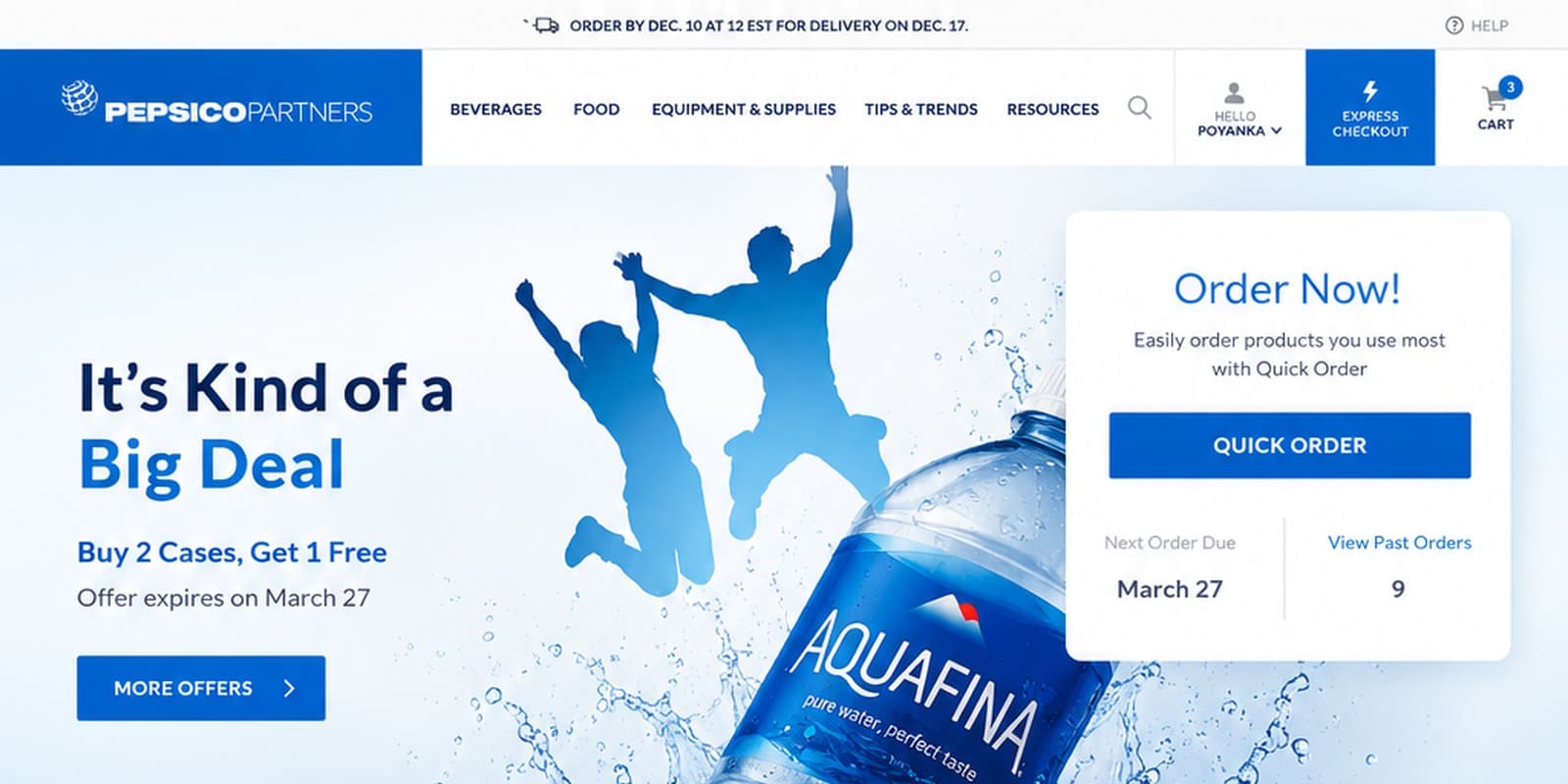
PepsiCo Partners needed a B2B commerce platform that matched how its customers actually shop — mobile-first, fast to reorder, and consistent across every device. We audited the existing site, mapped three Golden User Journeys, and shipped a fully responsive redesign in two phases.
/ 01 — The Challenge
A site that wasn't built for how customers actually buy.
PepsiCo Partners' customers — grocers, restaurants and retailers reordering beverages, food and supplies in bulk — needed to move fast. But the existing site's navigation was cramped, sign-up CTAs were redundant, and the experience wasn't omni-channel, despite a majority-mobile audience. A full UX audit across aesthetics, information architecture, content and user journeys confirmed it: the site needed more than a visual refresh.
Social research reinforced the same story — a mobile-first customer base that wanted faster reordering, not more content to read.
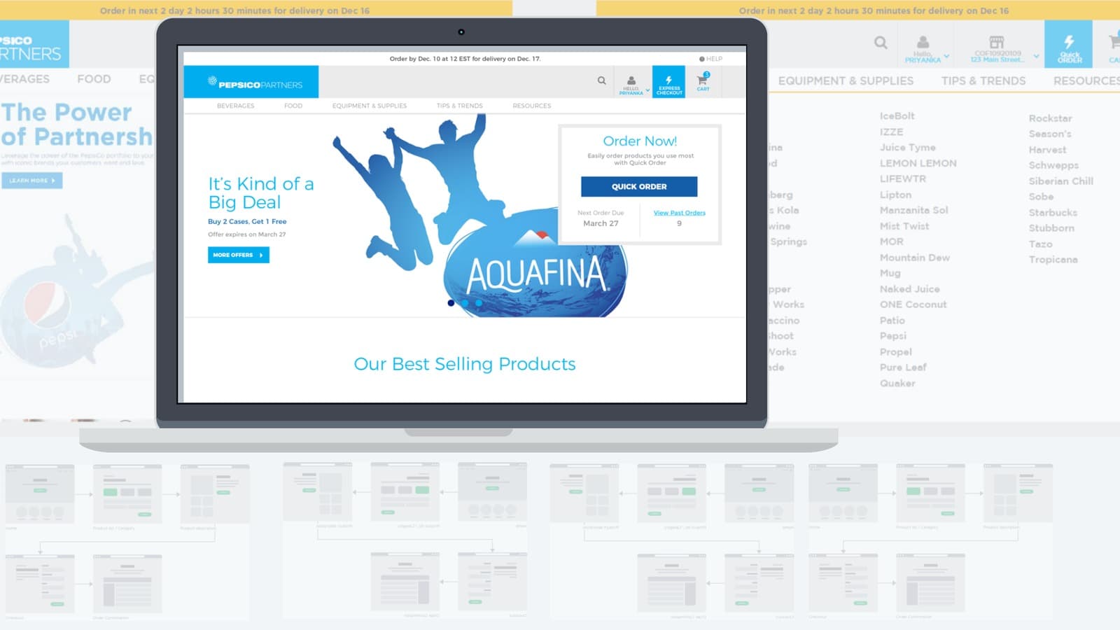
Figure 1 — the existing site's navigation and IA, audited and mapped before any redesign work began
/ 02 — The Approach
Three journeys, mapped end to end.
Instead of redesigning page by page, we mapped the three journeys that mattered most to PepsiCo Partners' customers — Express Checkout, Standard Cart, and Order History Re-order — and built interactive prototypes in Axure, Sketch and Omnigraffle to usability-test each one before a single visual screen was finalized.
- Golden User Journey mapping for Cart (Express Checkout), Cart (Standard), and Order History (Re-order), each broken into clear, testable steps.
- Usability-tested the most complex, transaction-heavy flows against real customer scenarios before committing to visual design.
- Built a custom grid-based structure for the key templates, so engineering could implement cleanly and consistently from Zeplin.
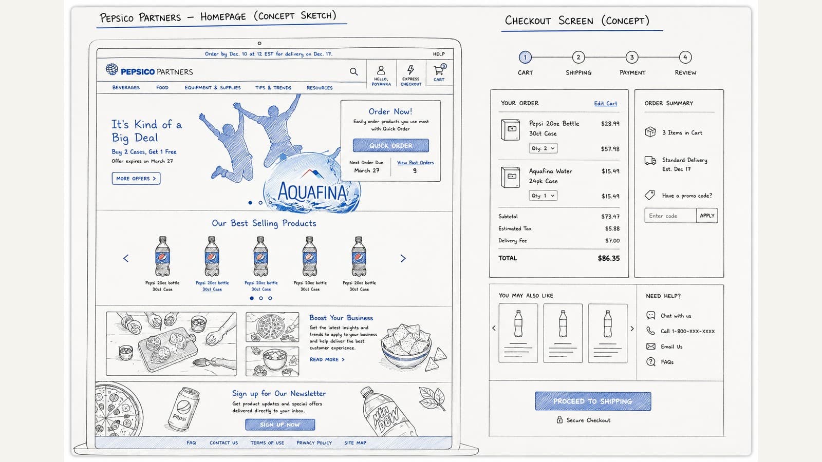
Figure 2 — early concept sketches for the homepage and checkout journeys, worked out before any visual design began
/ 03 — The Solution
Two phases, one consistent experience.
Phase 1 shipped Express Checkout and Quick Order — ordering in two clicks — alongside a sophisticated taxonomy, predictive search, and full feature parity across desktop, tablet and mobile. Phase 2 layered in Articles, Recipes, Tips & Trends, Level-2 personalization ("Recommended for you"), a newsletter, mini-basket, and location-based product listings.
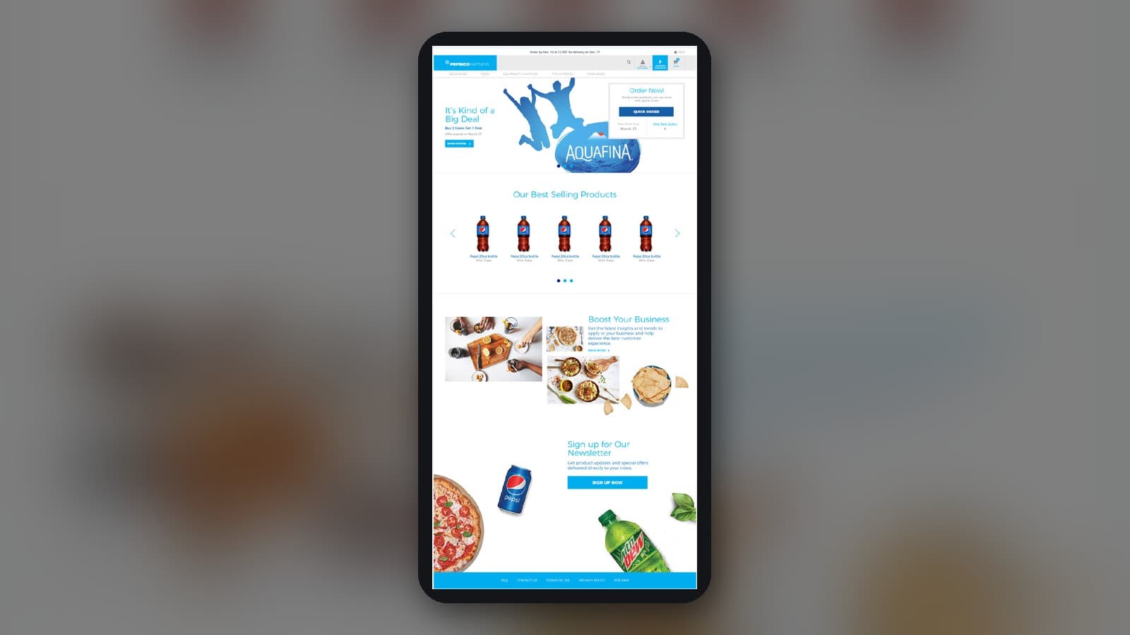
Figure 3 — the shipped mobile homepage, sharing the same component system as desktop
/ 04 — The Results
The numbers that moved.
- 8-month engagement leading a cross-functional team of UX designers, visual designers and analysts.
- Three Golden User Journeys usability-tested and validated before build, reducing rework downstream.
- Fully responsive Phase 1 + Phase 2 rollout, with feature parity across desktop, tablet and mobile.
- A custom grid-based template structure handed off cleanly to engineering through Zeplin.
Want results like these?
Book a free 30-minute discovery call. No pressure. Just ideas.
Book a Call