
Virgin Media — Telecom & Media
Self-service, rebuilt for 5 million customers.
Virgin Media's My Offers & Upgrades journey needed a full responsive rebuild — a clearer way to browse Broadband, TV and Phone bundles, add extras, and check out, without the tangle of nested tabs the old flow buried customers in.
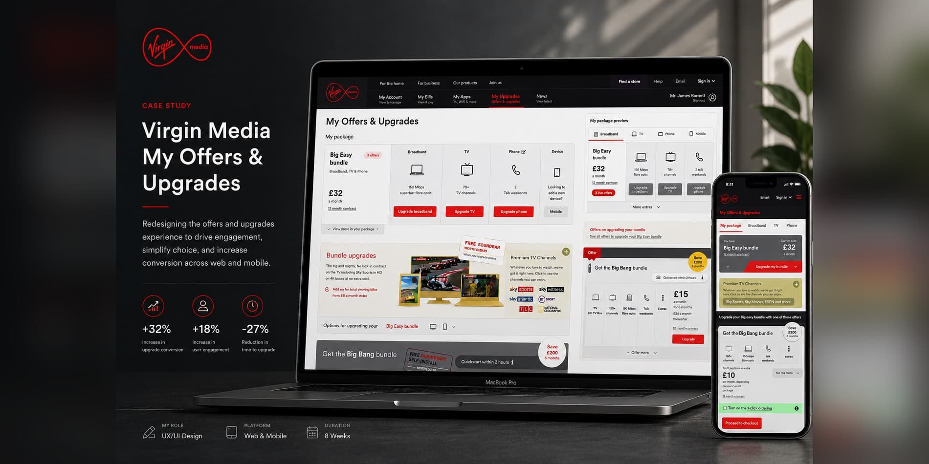
/ 01 — The Challenge
A package widget outgrowing its own structure.
Virgin Media customers manage Broadband, TV and Phone as one bundled package, but the "My Offers & Upgrades" experience hadn't kept pace — extras, premium channels and upgrade paths were buried several taps deep, and the flow wasn't consistent across desktop, tablet and mobile. Every scenario a customer might land in — checking a current plan, adding a TiVo box, upgrading broadband speed — needed its own clear path in, without customers losing track of what they already had.
Mapping the existing sitemap made the problem visible: a deep tree of tabs, extras and conditional checkout states, each one a chance for a customer to drop off.
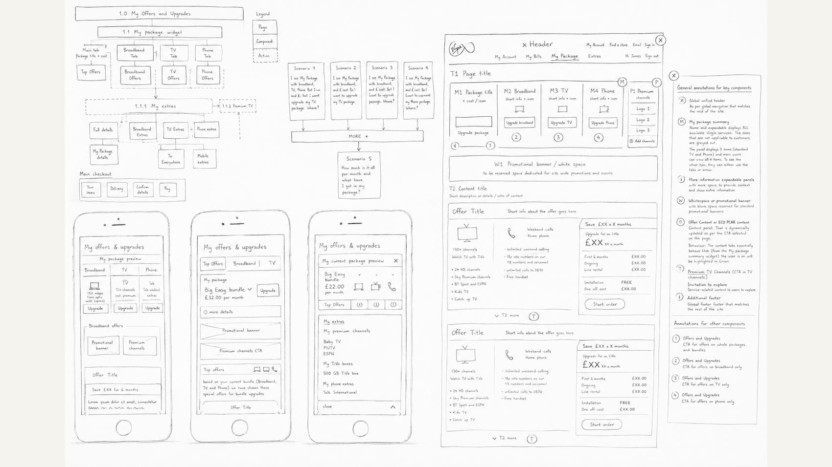
Figure 1 — preliminary early stage wireframes and user research
/ 02 — The Approach
Research-led, then redlined for build.
This was a full-funnel research effort before a single screen was drawn — A/B and multivariate testing, focus groups, card sorting, eye tracking, customer video and audio recordings, click-tail analysis and storyboarding, run with both in-house and online audiences.
- Walked five real customer scenarios end to end — from "I just want to see my bill" to "I want to add a new TiVo box" — to confirm the new structure resolved the confusion the old one caused.
- Designed a componentized page system (package summary, promotional banner, offer content, upgrade CTAs) with fully annotated redlines so engineering could build each panel independently.
- Prototyped mobile-first, validating the "My Offers & Upgrades" flow on iPhone before scaling the same components up to tablet and desktop.
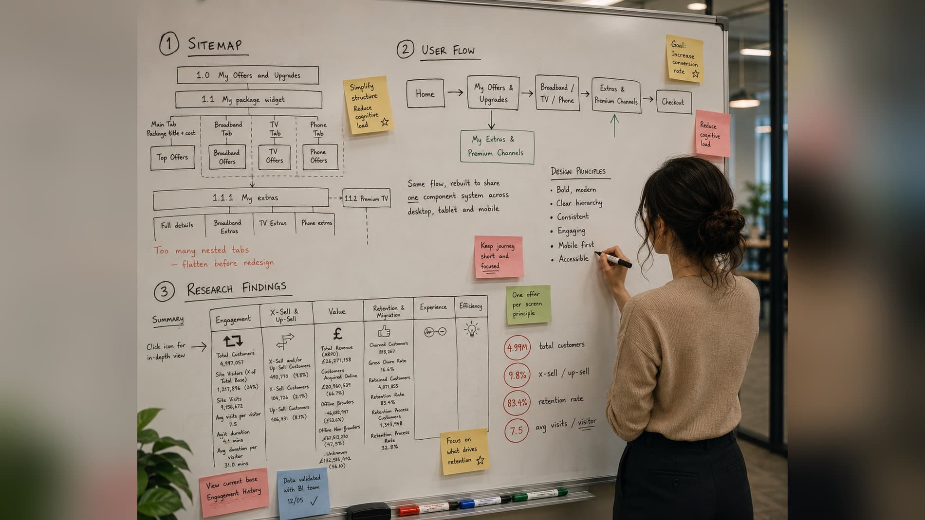
Figure 2 — sitemap, user flow and research findings, mapped out on the whiteboard
/ 03 — The Solution
One responsive checkout, built for x-sell.
The shipped experience gave Virgin Media a fully responsive, interactive "My Offers & Upgrades" flow across desktop, tablet and mobile, plus a rebuilt review-and-buy checkout with 1-click ordering, Quick Start, profile management, a mini-basket and on-page discounts. Ongoing optimization was driven by a stack of in-house and third-party tools — Usertesting.com, Crazyegg, Nomensa, Maxymizer, Eyequant and Clicktale among them — feeding continuous refinements back into the live product.
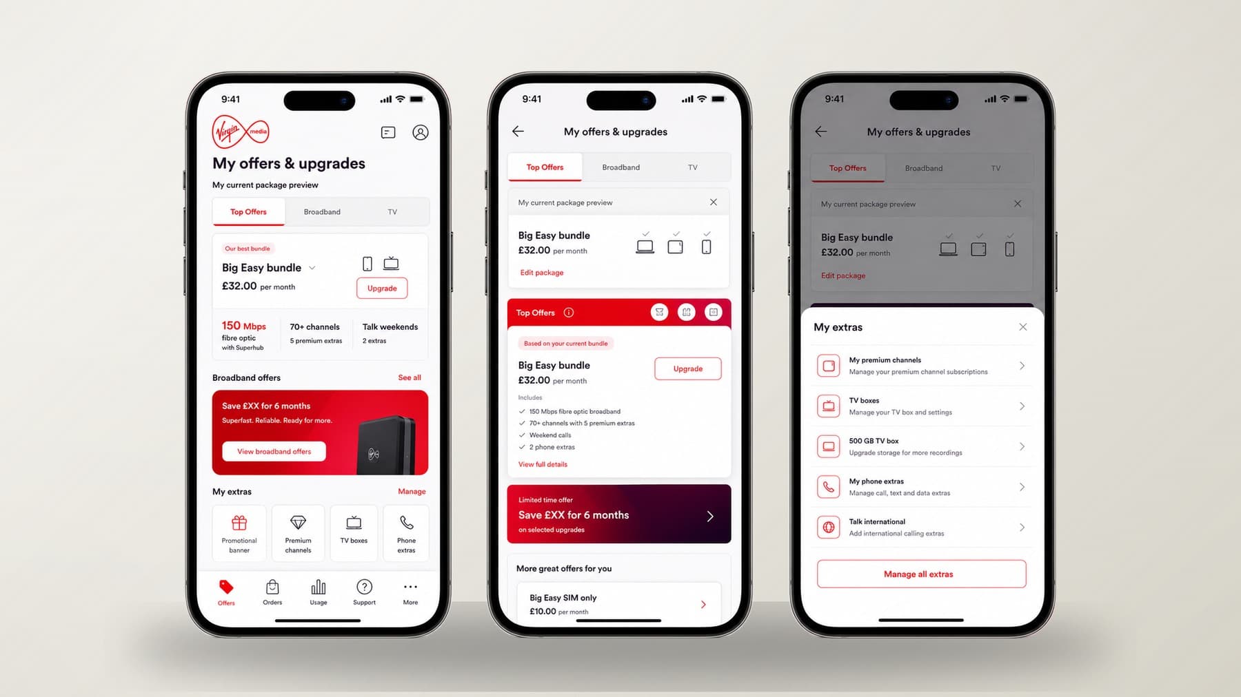
Figure 3 — the shipped flow across the mobile journey, sharing the same component system as desktop
/ 04 — The Results
The numbers that moved.
- Nearly 5 million customers on the base, with 24% actively self-serving through the redesigned online journey.
- 9.8% of visiting customers were x-sold or up-sold directly through the new offers panel — with average visitors returning 7.5 times.
- 83.4% retention rate on the rebuilt package flow, against a total customer revenue base of roughly £262.7M.
Want results like these?
Book a free 30-minute discovery call. No pressure. Just ideas.
Book a Call